Residential water use in the East Bay of San Francisco
This project was completed for a guided study class designed to serve as a capstone project for my focus in data analysis at Michigan State University under the tutelage of two Phd data analysts.
I was assigned 50+ .xlsx files regarding water use among residents of the East Bay area of San Francisco gathered between the drought of 2012 and 2019 by the East Bay Municipal Service comprising 15+ million rows of data.
Primary Questions
Summary of Conclusions
53 .xlsx files were read into python using the pandas library.
Frames were concatenated into two series to be cleaned and prepared to be joined.
Series data was cleaned by dropping NaN columns.
Series are concatenated into a single frame. and then cleaned of nulls and duplicates.
All unique customer codes are found and renamed according to their type as listed on the East Bay Municipal Service website. Res_ and Com_ tags are assigned to make future parsing of categories simpler.
Data types were converted to proper types.
CCF was converted to a Gallons Used Daily column so water use could be more easily understood and explained.
Our dataset did not have the necessary information regarding drought conditions in order to complete our analysis.
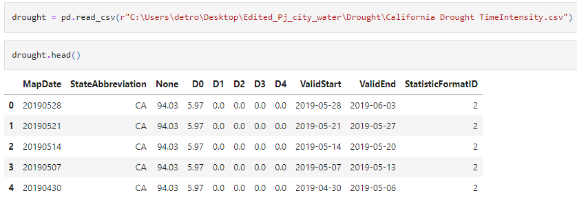
Additional data was required, so we sought out data from the US National Drought Monitor in order to enrich our primary dataset.
Data was brought into a new work book, cleaned and transformed in order to create an weighted Drought Intensity metric from drought classes.
New Drought Intensity Metric was checked to see if the shape fits to source data; it did.
Once the drought data was brought in to the main workbook it needed to be joined with the primary datsaet on water use.
However, this produced a unique challenged: the periods our water data covered were irregular, with day ranges between 30 and 90 days.
In order to append the primary dataset with the drought information it was necessary to write a loop which would take a mask and append the data from the drought table, which had information for each day within the time period, to the primary dataset.
This loop went through the drought table and:
1. Found the range of days according to each row of the primary dataset
2. Summed those values then averaged them by the number of days
3. Appended the primary dataset with a column with the Drought Intensity for each row.
Outlist was checked to see if it matched the number of rows in the primary dataset; it did.
Outlist was converted to a pandas data frame and joined onto the primary dataset.
With the dataset fully enriched the residential data was separated from the commercial data and work began on graphing and analyzing the data.
However, early into this analysis we were presented with seemingly contradictory data.
Our scatterplot seemed to indicate a drop off in water use as drought intensity (drought factor) increased.
This was contradicted by our heatmap which showed no correlation.
We were confronted with two possibilities:
1. The scatterplot is correct, and water use decreased with drought intensity.
2. The heatmap is correct, and the water use did not vary with drought intensity.The hypothesis was developed that the scatterplot was incorrect, and that the seeming drop off was an illusion of the data’s shape - we simply have very few points where drought intensity is above 90.
To test this hypothesis we went through several steps.
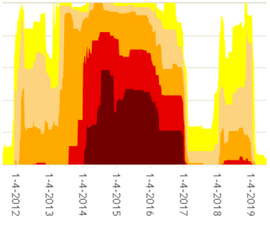
1. The drought factor weighted calculation was double checked to see if it matched the source data; it did.
Source data from US Drought Monitor
Weighted drought factor to measure drought intensity
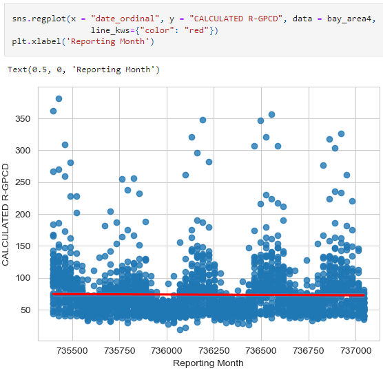
2. Independent data on water use on the area/period was gathered on water suppliers from the National Oceanic and Atmospheric Administration. Times were converted to ordinal values for simple linear regression. The trend of water use over the period was flat, despite highly variable drought conditions (note: seasonal variation does exist, and may correlate with drought spikes influenced by seasonal conditions, however we are concerned with the trend over the entire drought timespan).
3. Finally, we graphed the count of the data points in a histogram which clearly showed our data points skewed towards lower drought intensity, causing the drop off at 90 drought factor in the scatterplot.
With this ambiguity cleared up, we were able to move on to analyzing the rest of the data and the trends relevant to our questions. If you would like an in depth look at how these questions were explored and visualized, you can access a power point on these questions here.


