
Blog Discussion: Disability Audit
It’s important to be mindful of accessibility when working with our data to ensure it is easily used by our colleagues and stakeholders. We shouldn’t assume accessibility is not an issue even if it is not immediately visible. Often these are invisible issues, and are more common than many might expect.
1 in 12 males have some form of color blindness.
1 in 5 Americans are Dyslexic to some degree.
1 in 23 Americans have impactful visual impairment.
As a general best practice we should work to develop data hygiene and practices that incorporate accessibility.
To this end we will go through a data set from UC Irvine regarding road lane usage in Excel that has been cleaned up and formatted for use without consideration to accessibility and make alterations to resolve accessibility issues.

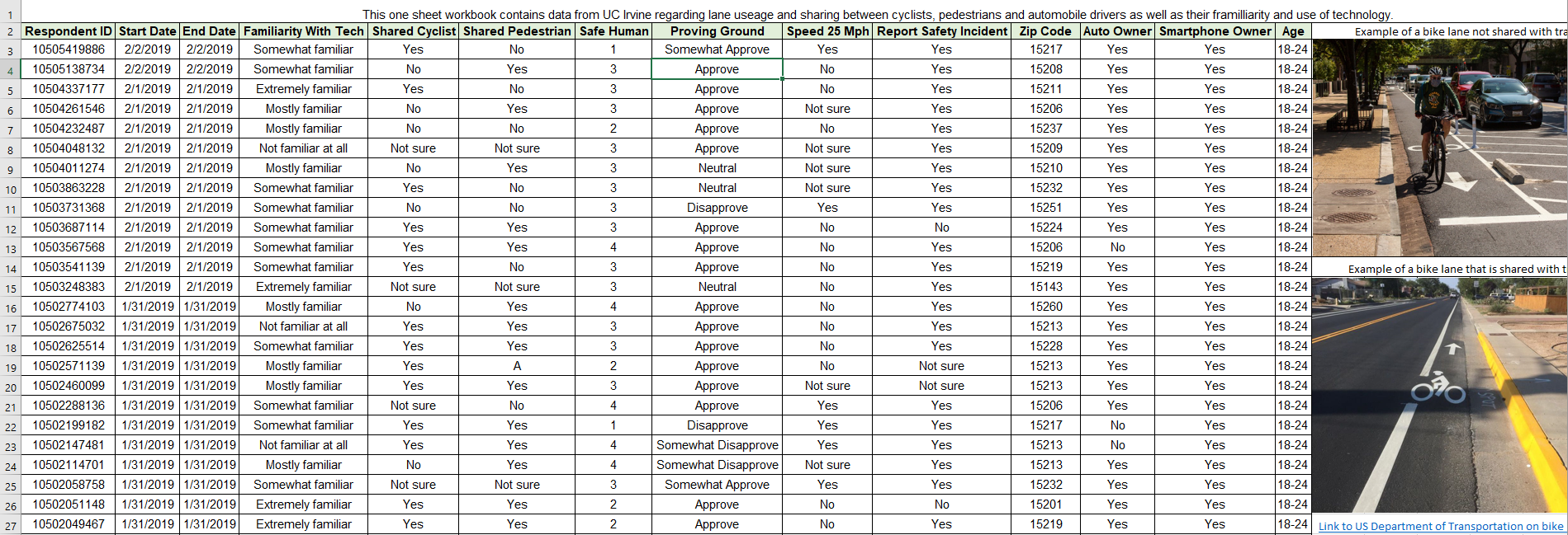
Here’s our default worksheet. We can see from the start it has some issues. The first problem we will deal with is the presence of blanks. Blank rows should be removed as part of basic data cleaning aside from accessibility, but they do cause issues for people using text to speech software in particular. We will generally try to avoid blank cells within the data area of the spreadsheet.


We’ll use the Go To Special tool to find all the blank rows and delete them. If we had blanks for a reason, we would want to specify that those cells were left blank intentionally.
People using text to speech readers depend on thoughtful description and formatting of a workbook. So next we’re going to go through and make some adjustments to help clear up what is going on in the workbook.


We’ve done a few things here to help people using text readers.
First: we’ve named the column ranges to help give more context for text reading software.
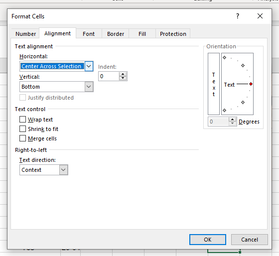
Second: we’ve added a description to the workbook. It’s easy to forget how much information we take in and put together at a glance. Information that a person with visual difficulties benefits from having described at the beginning of a sheet. Note: we did not merge cells, this can cause a problem with text readers, instead we aligned the text within one cell to display across multiple cells; as we will going forward.
Third: we’ve separated the words within our column headers to make it easier for a text reading program which might not be able to interpret something like “autoowner” or default to spelling it out.


Here we’ve made several changes to increase general readability.
We changed the font to Arial, well known for its readability among those with dyslexia.
We added more white space padding by slightly increasing cell height and centering the text horizontally and vertically. This can help those with vision difficulties and dyslexia.
We’ve adjusted the column header width and added borders to all cells.


Here we’ve addressed many issues with the images.
We changed the color of the descriptive text to avoid blue/yellow colorblindness as well as made the text descriptive.
We cleaned up the images, getting rid of unnecessary blank spaces.
We added a descriptive hyperlink so those using text readers know what the link is for.
We’ve added descriptive alt text to the images for a text reader. So that it can describe the important information in the images.


Finally, we’re going to change the header backing color. While red and blue pairings are generally legible for those with red/green color blindness it can still be more difficult than simpler high contrast colors not on the spectrums color blindness effects. We can still keep our data displays colorful, we just need to be considerate of the color choices we use - namely avoiding combining reds and greens or blues and yellows. We should keep colors pale, and make sure to use high contrast.
Whenever we use colors in a header we should also pair it with bold text. It looks a little muddy in the image, but it’s much higher contrast in the workbook itself, which you can download at my Github.


Wrap Up
Simple decisions as we build out our data presentation such as avoiding blanks, making sure to use descriptive language frequently, choosing high contrast text and adding white space can dramatically increase accessibility. Accommodating visual and reading impairments requires very little additional effort if we build mindful habits in the course of our work.
I’ve had several colleagues with visual or reading impairments; including a color-blind former industrial electrician who overcame his adversity when dealing with wire colors by developing an entire system using twist ties from bread bags. Simple practices that are mindful of these adversities can dramatically reduce the time and effort those with visual and reading impairments must dedicate to working around our design choices after the fact.
As my electrician buddy often said, “Good habits make hard work easy”, twist ties still in pocket.